背景:
改造已有winform项目,原有项目包含多种第三方插件
介绍:
WPF Material Design 是一种基于 Windows Presentation Foundation(WPF)框架的设计风格,旨在为桌面应用程序提供现代、富有层次感的用户界面。它结合了Google的Material Design理念,突显实用性和美观性,为开发人员提供了一套丰富的控件、动画和样式,以改善用户体验。这个设计风格注重阴影、动画和色彩的运用,使界面看起来更加生动、有层次。WPF Material Design简化了开发流程,开发者可以轻松地集成这些现代化的设计元素,从而创建出符合当今用户期望的高质量应用程序。完全开源,是 WPF 最流行的 GUI 库之一,该库还与 MahApps 和 Dragablz 兼容。
特性:
- 现代化设计风格: 基于Google的Material Design理念,采用现代、扁平、富有层次感的设计元素,使用户界面看起来更加时尚和符合当代趋势。
- 丰富的控件库: 提供了一套丰富的现成控件,包括按钮、文本框、卡片等,这些控件都经过设计,使得开发者能够轻松构建符合Material Design标准的应用程序。
- 动画效果: 强调运用动画增强用户体验,如过渡效果、按钮点击效果等,使界面更生动、引人注目。
- 色彩和图标的规范化: Material Design 强调使用清晰、鲜艳的色彩,以及简单直观的图标,有助于提高用户认知和操作的便捷性。
- 阴影和深度感: 通过巧妙运用阴影效果,为界面元素增加深度感,使用户更容易理解界面的层次结构和交互关系。
- 可定制性: 虽然提供了一套默认的设计元素,但也允许开发者根据自己的需求进行定制,以满足特定应用程序的设计要求。
- 支持高分辨率屏幕: 考虑了高分辨率显示屏的使用,确保应用程序在各种屏幕尺寸和分辨率下都能够展现出最佳的外观。
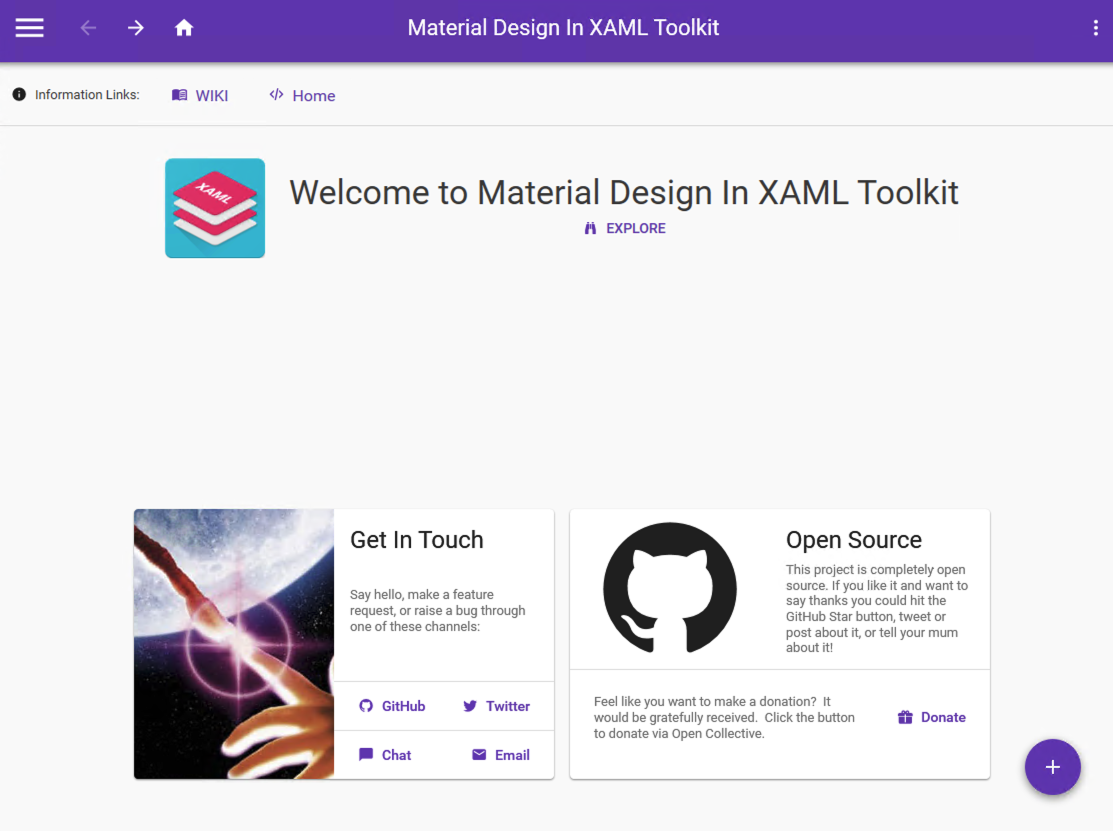
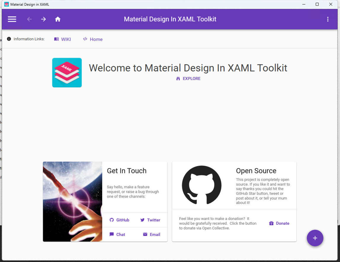
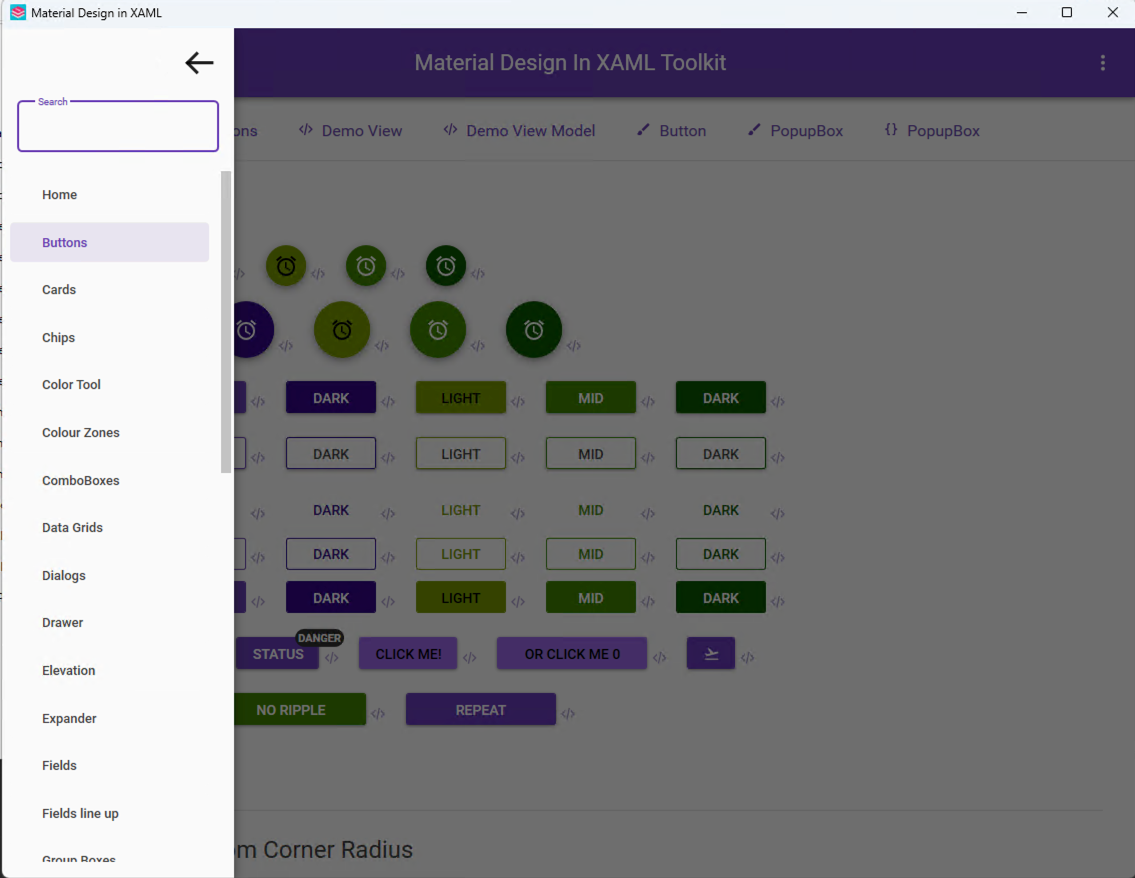
官方预览模板:
本地启动启动 MaterialDesignDemo.exe,可以查看多种官方示例组件
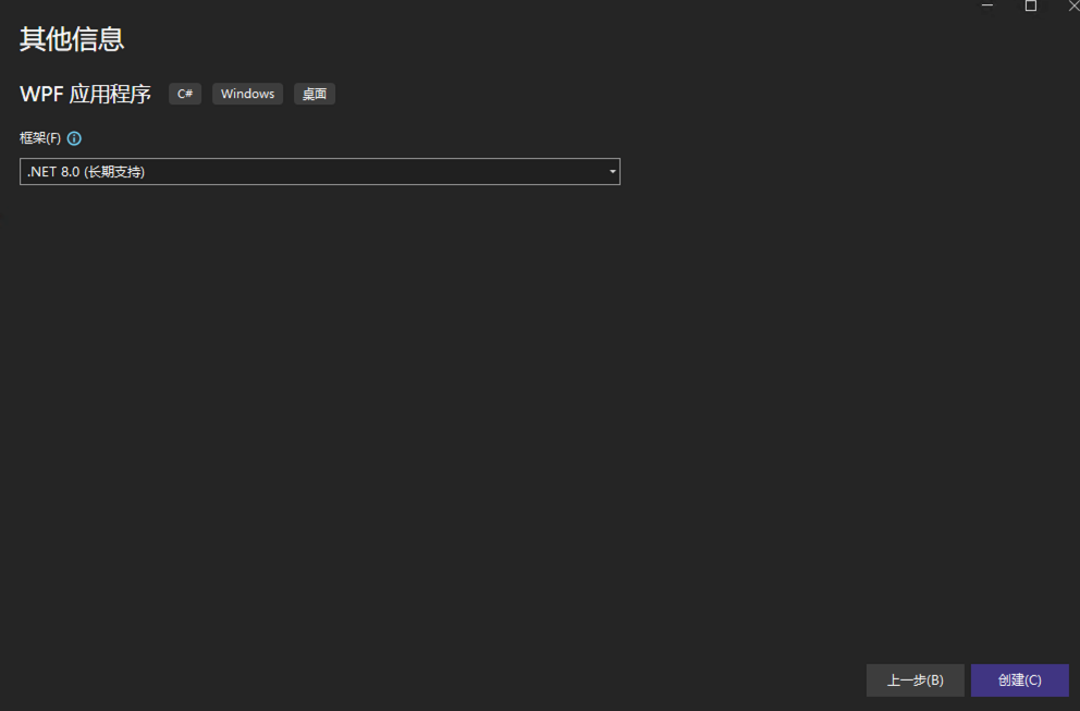
VS2022中新建wpf项目
- 选择.net版本
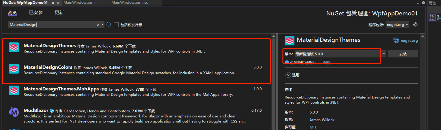
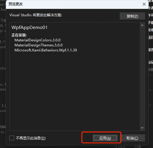
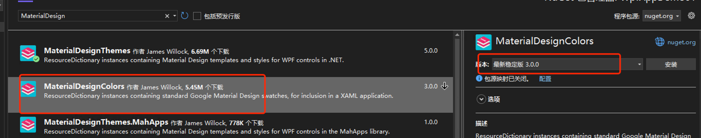
- NuGet添加MaterialDesign依赖
- 配置App.xaml
<ResourceDictionary Source="pack://application:,,,/MaterialDesignThemes.Wpf;component/Themes/MaterialDesignTheme.Defaults.xaml" /> 完整配置App.xaml
<Application.Resources>
    <ResourceDictionary>
        <ResourceDictionary.MergedDictionaries>
            <materialDesign:CustomColorTheme BaseTheme="Light" PrimaryColor="Aqua" SecondaryColor="DarkGreen" />
            <ResourceDictionary Source="pack://application:,,,/MaterialDesignThemes.Wpf;component/Themes/MaterialDesignTheme.Light.xaml" />
            <!-- <ResourceDictionary Source="pack://application:,,,/MaterialDesignThemes.Wpf;component/Themes/MaterialDesignTheme.Defaults.xaml" /> -->
            <ResourceDictionary Source="pack://application:,,,/MaterialDesignThemes.Wpf;component/Themes/MaterialDesign3.Defaults.xaml" />
            <ResourceDictionary Source="pack://application:,,,/MaterialDesignColors;component/Themes/Recommended/Primary/MaterialDesignColor.DeepPurple.xaml" />
        </ResourceDictionary.MergedDictionaries>
    </ResourceDictionary>
</Application.Resources>注意:MaterialDesign 5.0 版本中已修改文件名 MaterialDesignTheme.Defaults.xaml 替代为 MaterialDesign2.Defaults.xaml and MaterialDesign3.Defaults.xaml
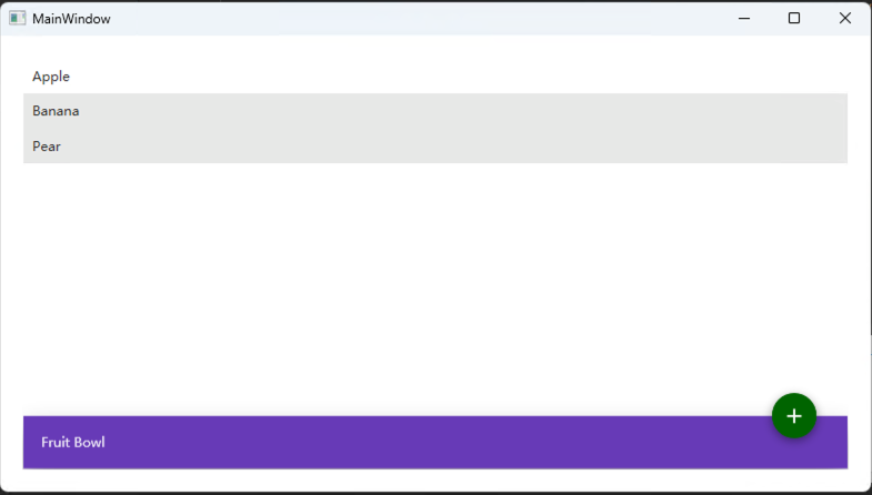
- MainWindow.xaml添加内容
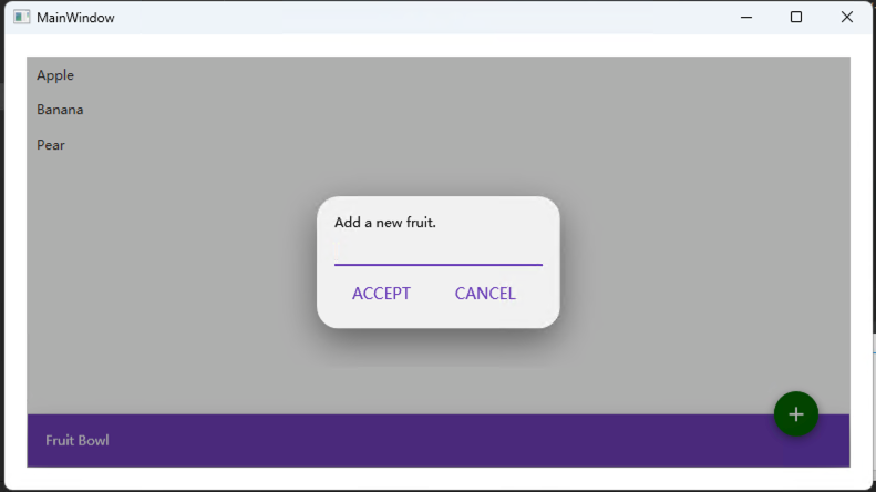
<materialDesign:DialogHost    DialogTheme="Inherit"
    DialogContentUniformCornerRadius="20">
    <materialDesign:DialogHost.DialogContent>
        <StackPanel            Margin="16">
            <TextBlock                Text="Add a new fruit." />
            <TextBox                x:Name="FruitTextBox"                Margin="0,8,0,0"
                HorizontalAlignment="Stretch" />
            <StackPanel                HorizontalAlignment="Right"
                Orientation="Horizontal">
                <Button                    Margin="0,8,8,0"
                    Command="{x:Static materialDesign:DialogHost.CloseDialogCommand}"
                    Content="ACCEPT"
                    IsDefault="True"
                    Style="{StaticResource MaterialDesignFlatButton}">
                    <Button.CommandParameter>
                        <system:Boolean xmlns:system="clr-namespace:System;assembly=mscorlib">
                            True
                        </system:Boolean>
                    </Button.CommandParameter>
                </Button>
                <Button                    Margin="0,8,8,0"
                    Command="{x:Static materialDesign:DialogHost.CloseDialogCommand}"
                    Content="CANCEL"
                    IsCancel="True"
                    Style="{StaticResource MaterialDesignFlatButton}">
                    <Button.CommandParameter>
                        <system:Boolean xmlns:system="clr-namespace:System;assembly=mscorlib">
                            False
                        </system:Boolean>
                    </Button.CommandParameter>
                </Button>
            </StackPanel>
        </StackPanel>
    </materialDesign:DialogHost.DialogContent>
    <Border        MinHeight="256"
        BorderBrush="{DynamicResource PrimaryHueMidBrush}"
        BorderThickness="1"
        ClipToBounds="True">
        <Grid>
            <Grid.RowDefinitions>
                <RowDefinition                    Height="*" />
                <RowDefinition                    Height="Auto" />
            </Grid.RowDefinitions>
            <ListBox                x:Name="FruitListBox">
                <ListBoxItem                    Content="Apple" />
                <ListBoxItem                    Content="Banana" />
                <ListBoxItem                    Content="Pear" />
            </ListBox>
            <materialDesign:ColorZone                Grid.Row="1"
                Effect="{DynamicResource MaterialDesignShadowDepth5}"
                Mode="PrimaryMid">
                <TextBlock                    Margin="16"
                    Text="Fruit Bowl" />
            </materialDesign:ColorZone>
            <Button                Grid.Row="0"
                Margin="0,0,28,-20"
                HorizontalAlignment="Right"
                VerticalAlignment="Bottom"
                Command="{x:Static materialDesign:DialogHost.OpenDialogCommand}"
                Content="{materialDesign:PackIcon Kind=Plus,                                                         Size=22}"
                Style="{StaticResource MaterialDesignFloatingActionMiniSecondaryButton}" />
        </Grid>
    </Border>
</materialDesign:DialogHost>- 编译运行
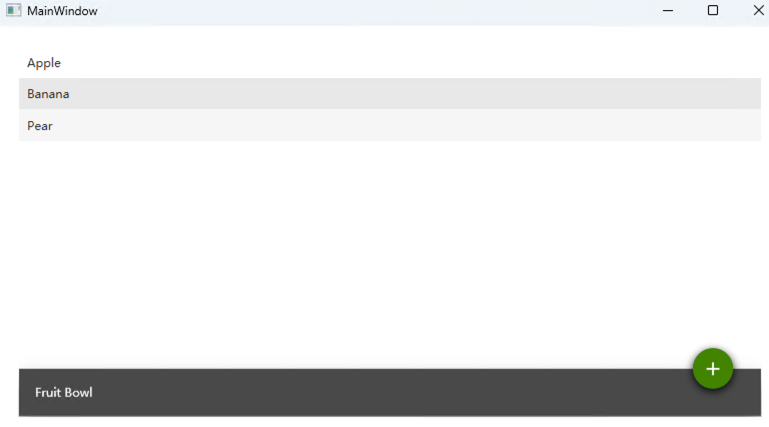
除了使用官方定义的主题外,还可以手动指定主题颜色
 #修改 PrimaryColor和SecondaryColor值为自定义RGB颜色
 <materialDesign:CustomColorTheme BaseTheme="Light" PrimaryColor="#494949" SecondaryColor="#408400" />
效果:
相较于AvaloniaUI来说,MaterialDesignInXAML适合老项目改造升级,在适配winform、wpf等原生组件上有明显优势,而前者更适合新项目开发,来满足应用的跨平台性